Tangerine UI problems
I’ve been a big fan of Tangerine for a while, it’s a bank that doesn’t charge fees and does what I need to do. They used to have a great app and website and then it all went a bit wrong.
It’s now a HTML app for Desktop and mobile. This isn’t the fault of the tools used, but there’s some terrible choices in the app across both.
Notifications
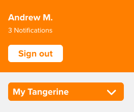
On my phone I get the notification number on my app screen. So, I open up the app and I get this little message:

But, you can’t click on it. It’s not a link, to find your notifications you have to go to Profile & Settings, scroll down to Inbox and then you can access the notifications. If notifications that are that important, how about you put a way to access them somewhere obvious.
Here’s a notification:

Space
When you open the app, a full 1/3 of the screen is an advert:

Let’s dismiss that:

Oh come on Tangerine. I’m not logging into my phone to get “Insights”, otherwise known as “Advertising”. Stop taking up space with this crap.
Cancelling
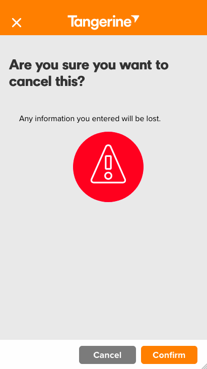
Pop quiz. You are cancelling this transaction. What does the Cancel button do?

The Cancel button cancels the cancelling. The highlighted option Confirm actually continues the cancelling. You know what would be clearer? Yes or No.
Cluttered
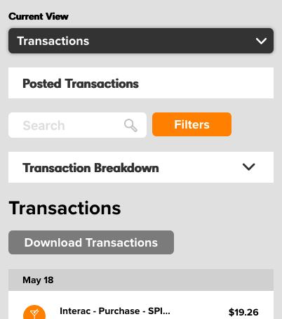
Supposing I wanted to see my transactions on an account. There’s about one half of the screen to scroll down. The black text Posted Transactions doesn’t actually do anything. The transaction list is an infinite scroll. So instead they’ve put everything at the top of the page, such as Search, Transaction Breakdown and so on.

Then there’s another title Transactions. Do you get the idea that in those 5 boxes saying Transactions, this might be about…
Overall
The overall feel of the app is that its full of spinners, far too cluttered and just to confusing. Hey not everything I’ve built is perfect, but even I can spot some real problems with this app. I pretty sure Tangerine can do better than this.
And yes, I’m writing this while drinking a beer I recently bought, as shown on my transaction page.
I’d still recommend Tangerine and their credit card. If you want to open an account, use my key: 20790922S1 to give get yourself a bonus.