Alternatives to vertical tabs
For the longest time I’ve used vertical tabs in Firefox and I still find it odd that people don’t use it more. It’s a simple fact that a horizontal tab strip doesn’t scale too well when you get lots of tabs.
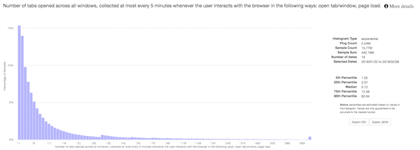
Of course, for most users this isn’t a problem, most users do not have a lot of tabs open according to Firefox telemetry:
But if you have a few the title just gets squished and squished till it becomes a scroll bar. Vertical tabs look great for this giving you lots of title space on a wide monitor:

Firefox is way better at this than Chrome. I sat next to someone who had nothing but triangles as their tab bar in Chrome. How did they cope?

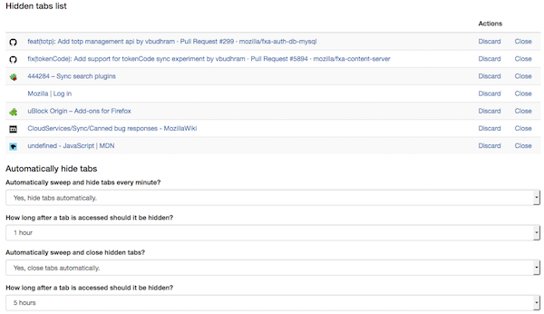
With the landing of the tab hiding API in WebExtensions in Firefox 59, I wanted to try and understand what the many people who were clamouring for this API wanted to do. So I wrote a quick extension that’s pretty terrible. It provided a “Hide this tab” context menu item on the tab to hide the tab. I then added a quick management page to list all the hidden pages.

That was ok, but clicking that menu item was tedious. So then I set it to just perform some actions for me. I’ve now got it set up to hide a tab if it hasn’t been looked it for an hour. Then five hours after that, if I haven’t opened it again, the extension just closes the tab.
I tried that for a week and found it pretty useful. Tabs that are hidden still show up in the awesome bar and as soon as I click on them, they come back instantly. Eventually they’ll get closed. They’ll still appear in the awesome bar and I can bring them back, just in a slower manner.
If I find myself saying “where was that tab…” I just go to the management view and its likely there.
This extension isn’t perfect, but its enabled me to stop using vertical tabs most of the time and now I’m torn which workflow is better. Maybe some combination.
