Bad UI
This one's a cracker. Been doing some research on some things I've been wanting to do. As it turns out, everything has been done (surprise). But when I see how bad some of these things are, I get amazed. Of course bad doesn't mean its not popular (MySpace).
One interesting comparison was Final Fantasy XI and World of Warcraft. From starting up to getting into the game, the former is extremely stodgy, requiring something like 9 clicks as you get into something called PlayOnline, Square Enix's completely unused and ignored platform for playing games other than FFXI. Warcraft, login, select character, and you are in - fast and slick the usual Blizzard experience.
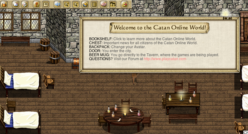
So today I took a quick look at trying to play Settlers of Catan online. After a frustrating sign up and Java client install, download I get this:

Thank god there's a dialog telling me to click on the mug to play a game. It's in the top left by the way. What are they thinking of.